Benjamin Moore paint colors are an important design choice because they set the mood for the entire project. And while paint is far from permanent, this importance causes many people to stress over selecting the perfect color. How do you decide on a color palette—let alone a specific shade? Enter, the Ultimate Handbook to Benjamin Moore Paint Colors.
This handbook is a beginner’s guide to color theory, explains the differences between paint finishes, and offers decision making tips so you can feel confident in your selection. Keep reading to get started!

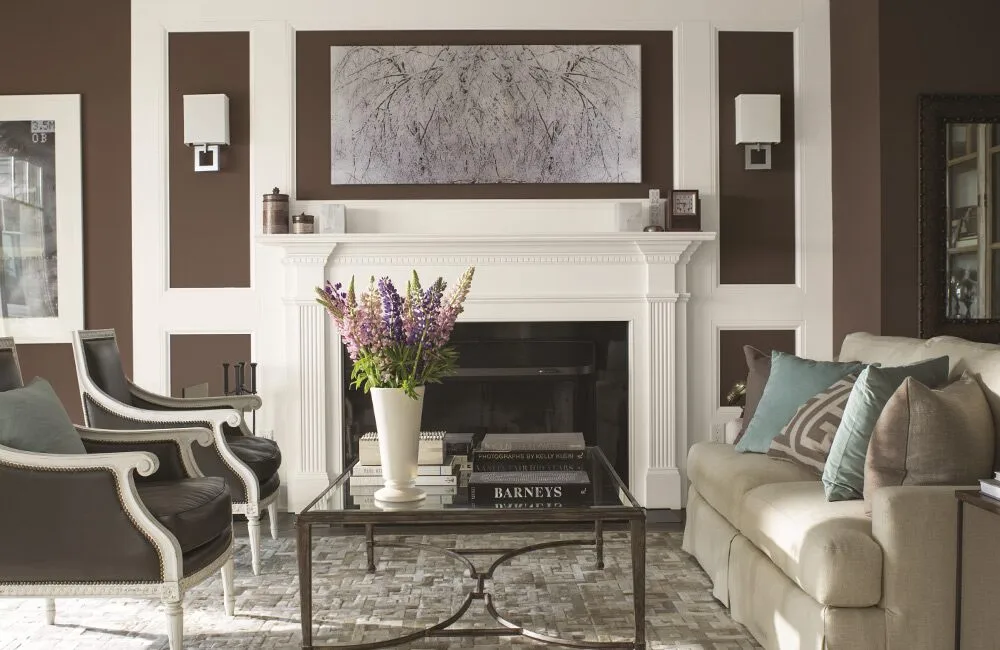
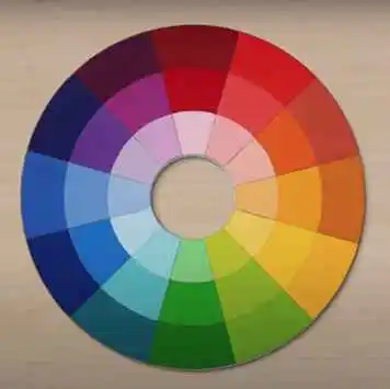
Picture taken from benjaminmoore.com
Understanding the Emotions of Color
Color has a significant impact on emotions and the “mood” you feel when entering a space. Therefore, it’s crucial to understand color’s emotional impact before considering paint options.
- Warm colors like red, orange, and yellow can foster feelings of energy, excitement, and warmth.
- Cool colors like blue, green, and purple can create a calm, serene space that encourages relaxation.
- Neutral colors like white, gray, and beige can evoke a sense of balance and simplicity.
Determining the mood you want to achieve will go a long way towards narrowing down not just your main paint color, but your entire color palette.
Picture taken from Color Handbook | Benjamin Moore
Choosing a Color Palette
To create a cohesive color palette, it’s important to understand how colors interact with each other based on where they sit on the color wheel. Here are three types of color palettes and the design impact of each:
- Monochromatic palettes use different shades of the same color to create a calming, unified effect in spaces that are often minimalist or modern in design. Achieving a cohesive look is virtually fool-proof because even though you’re working with different shades, it’s still only one color.
- Analogous palettes use colors that are adjacent on the color wheel like blue, blue-green, and green. Analogous colors appear softer next to each other, also creating a harmonious effect for a comfortable, inviting space.
- Complementary palettes use colors that are located opposite from each other on the color wheel like orange and blue. Complementary colors appear bolder and more vibrant next to each other. This palette creates a dynamic and energetic effect that can be used to make a bold statement or add drama to a space.

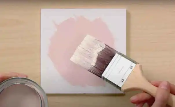
Picture taken from Color Handbook Sheen | Benjamin Moore
Selecting the Right Finish
Paints come in several different finishes. Which one you’ll use depends on what surface is being painted. Here’s a run down of the different options and their common uses:
- Flat paint has no shine and is typically used for ceilings. Limit flat paint to low traffic areas since it is less durable and more difficult to clean.
- Eggshell and satin paint offer a slight shine and are typically used for walls.
- Semi-gloss paint has a noticeable shine and is typically used for trim, doors, and high traffic areas.
- Gloss paint offers the most shine and is typically used for cabinets and furniture. It can also be used in areas where you expect mess, like the kitchen.
Note: The glossier the paint, the more durable and easier to clean it is.
Picture taken from Color Handbook: Light | Benjamin Moore
Testing Samples
How many times have you found that the paint color looks different on a full wall than it did on that little paint card from the store? Here are two top tips to counteract that:
Tip #1: Buy samples from a Benjamin Moore retailer (that’s us for Fairfield, IA!) and paint a large foam board to give you a better sense of what the color looks like on a large space.
Tip #2: Move that foam board around the room at different times of the day so you get to see what the color looks like in all types of light. It makes a big difference!
Benjamin Moore Paint at JC Huffman
JC Huffman is proud to be your local Benjamin Moore paint dealer. Contact us if you have any questions about selecting the right paint or stop in so we can mix up your perfect shade!